April 11, 2020 – I’ve put together a website with some friends that show these values for all countries dealing with the pandemic: DaysToZero.org
March 23, 2020
I think I found a way of looking at COVID-19 data in a way that makes intuitive sense to me – growth rate. For some context, let’s start with the Johns Hopkins scary dashboard:

Screenshot from this morning
This is a very dramatic presentation of information, and a good way of getting a sense of how things are going right now, which is to say, um… not well.
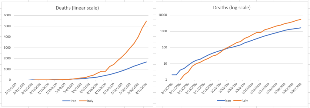
But if we look at the data (from here), we can break it down in different ways. One of the things we can do is look at trends in some different ways. Here, I’m going to focus on the daily death rate. In other words, what is the percentage of deaths from one day to the next? First, let’s look at Italy and Iran, two countries that are currently struggling with the worst of the crisis so far:

These still look horrible, but things do not appear to be getting worse as fast as they were in early February. The curves are flattening, but it’s still hard to see what might happen in the future. We’re just not good at understanding exponential charts like the one on the left much more subtle than “OMG!” Logarithmic charts like the one on the right can be misleading too – that’s a big jump between 1,000 deaths and 10,000 deaths at the top of the chart on the right. And at the bottom, we’re looking at nine deaths.
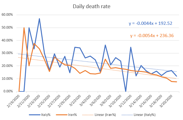
What happens if we look at the same data as a rate problem though?

That looks very different. After a big initial spike, both countries have a rate of decrease that fits pretty well to a linear trend. So what do we get if we plug the current rate of increase into those linear approximations and solve for zero? In other words, when are there zero new deaths?
As we can see from the far right of the chart, as of today, Italy’s rate of new deaths is 11.89%, or 0.1189. Iran is 7.66% or 0.0766. Using those values we get some good news:
- Italy: 27 days, or April 19th
- Iran: 15 days, or April 7th
Yay! But…
Let’s look at the US. There’s not really enough data to do this on a state-by state basis yet, but there is plenty of data for the whole country. Again, we get a good linear approximation. The problem is, it’s going the wrong way:

The increase in our death rate (0.69% per day) is more than either Iran’s or Italy’s rate of decrease. At this point, there is literally no end in sight.
Let’s look at the world as a whole using death rates. This time the best fit is a second-degree polynomial, which produces U-shaped curves:

Also not good. Things clearly improved as China got a handle on its outbreak, but the trends are now going the other way as the disease spreads out into the reset of the world. It’s clearly going to be a bumpy ride.
I’d like to point out that there is no good way to tell here what caused these trends to change. It could be treatments, or it could be susceptibility. Italy and Iran did not take the level of action that China did, yet if trends continue, they will be clear in about a month. We’ll know more as the restrictions loosen, and there is or isn’t a new upturn as the lid comes off.
